Submitted by Deepesh Agarwal on Sat, 03/30/2013 - 02:44
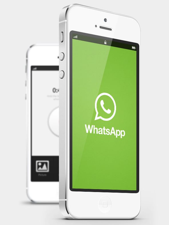
WhatsApp the leading free international text messaging app, is no short of an rage with it topping charts of all major mobile app platform charts. However, when it comes to design and usability the competetion - hike takes the prize without a second thought. German designer Julian Kraske has now taken his skills to show how this can be changed with a brand new WhatsApp design concept.


Image and design credits : Julian Kraske
Comments
This is Awesome..
This is Awesome..
anice syste to be adopted
anice syste to be adopted
This is pretty much like
This is pretty much like facebook and a Microsoft in one. It's got the swipe left layouts like on the facebook iPhone app, chat settings when you swipe right the way you can add media such as your location, voice messages, pictures and videos. Also the concept of the simple look, is similar to Windows 8. I personally like it put together but in my perspective a bit cheap due to the fact that these things are noticeable to a teenager.
But still looking forward to the new design
awesome.. Plz do it
awesome.. Plz do it
all features are from hike
these all are already existing in hike app, check once.
simply awful
simply awful
This Is Fantabulous !
Has Julian Kraske used photoshop for this awesome design. This is somewhat looking like facebook messenger with green ! :-)
Add new comment