Submitted by Deepesh Agarwal on Sat, 08/25/2012 - 23:16
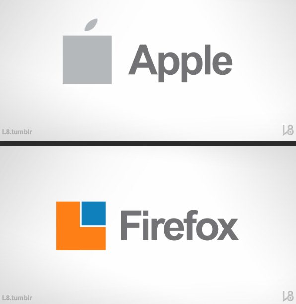
While there are both lovers and haters to Metro UI (now called Modern UI), Microsoft is going for a complete brand redesign around the tile interface. Imagine what if most famous brands have their logos redesigned with this new "boxy" concept, here is an interesting take by an designer (more after the jump, do notice Google and twitter makeovers).

Comments
Ehh
No offense, but L8 did a bad job. You can see that in Microsoft's name, the tittle/dot on the i is a circle, unlike all the i's above.
Lol and Mozilla actually takes Firefox's logo seriously. Check out all the tabs below "Identity" in the following link to see how much Mozilla talks about its own logo: http://www.mozilla.org/en-US/firefox/brand/identity/
Similarity to Linux OS
Just look like Meego OS
This is great tips
Great design your logo collection is very nice but you can do more efforts to some more improve your designs. You can use illustration with the help of sponge tools you can increase your designs pixels and corners. I am professional designer and here in Middle East with leading firms. We have multiples projects online logo designer as well. You open our websites and easily you can designs online logo as you like we are provide multiples options and designs. If you want to create custom logo and you don’t like giving designs you can feel free to contact us we also provide training and designs concepts.
Add new comment